Watercolor Rendering
As some of you may know, I went to art school for interior design, so I spent a lot of those four years drawing architectural plans, elevations, details, etc. Since I have graduated, I've rarely had the chance to flex those drawing and rendering muscles... until now! I was forced to organize my closet (a blessing in disguise) and came across a frame that I had completely forgotten about, and just around the same time I had also gotten a request for some architectural artwork - serendipity at it's finest right there.
Supplies:
Camera
Photo editing software
Pencil
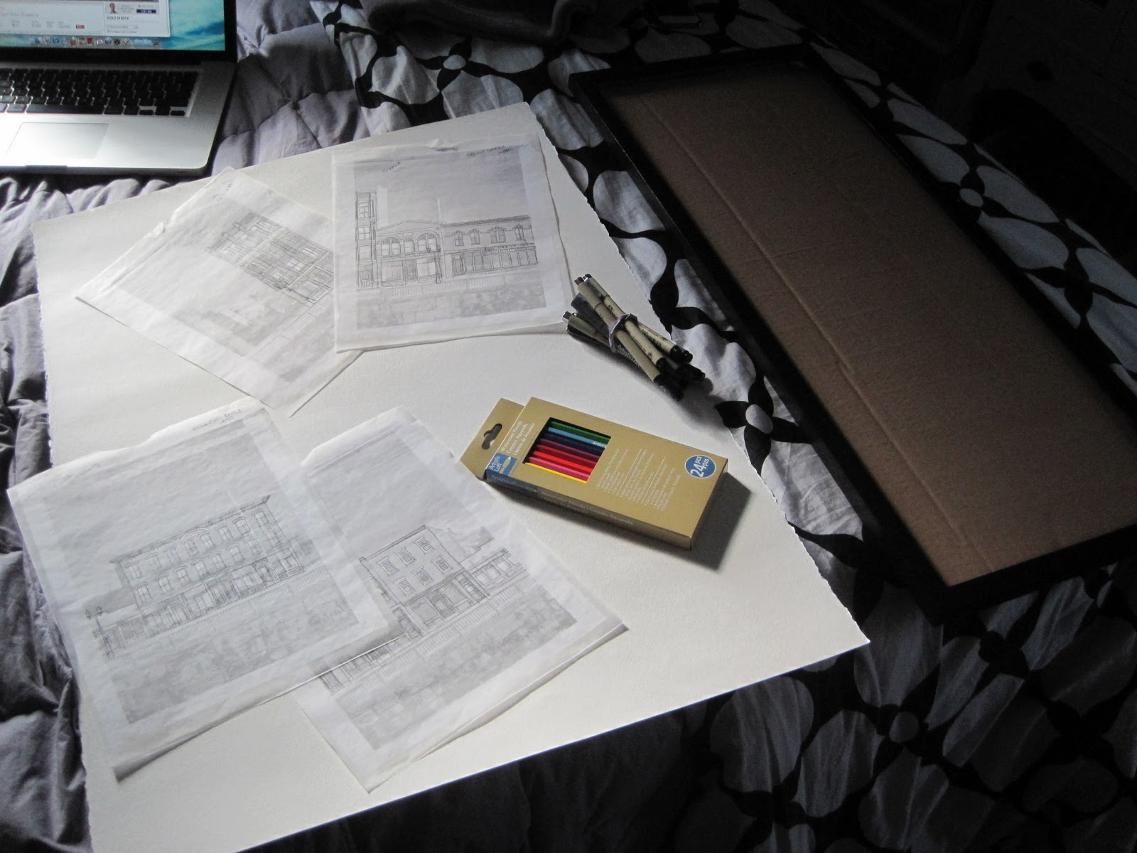
Archival ink pens
Watercolor pencils
Watercolor paper
Tracing paper
Tape
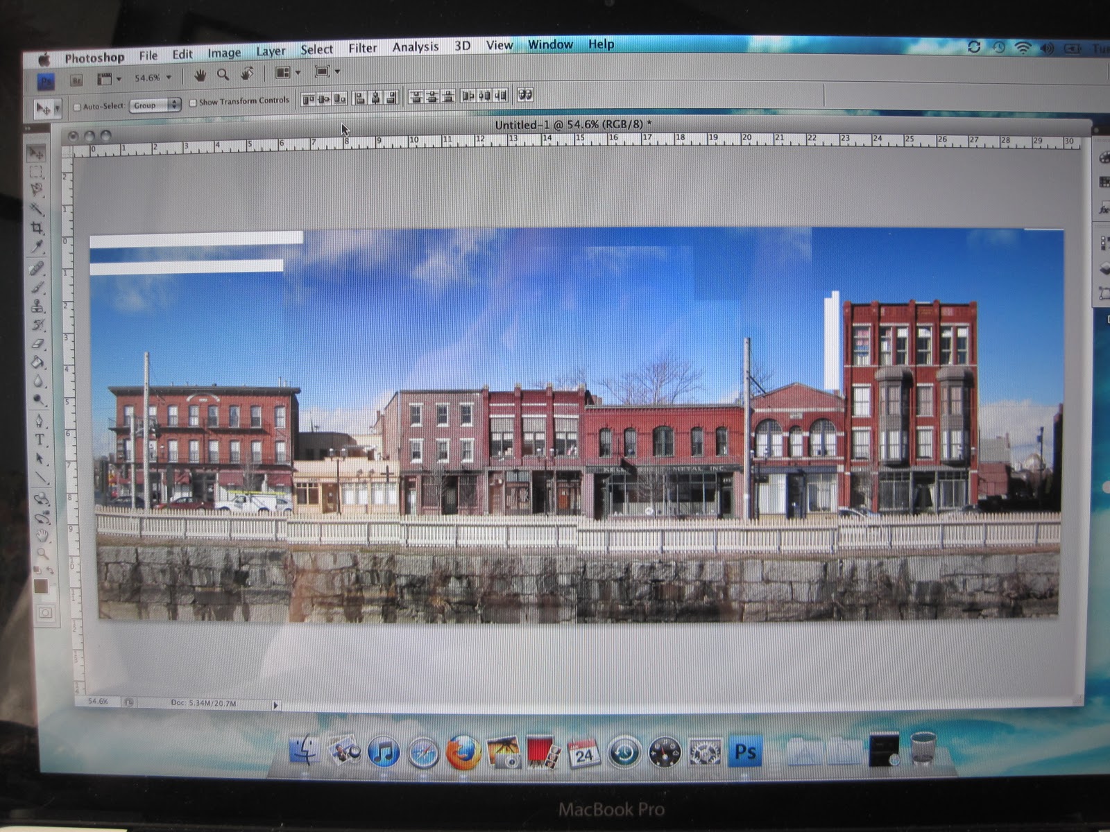
So off I went with my camera to Dutton Street in Lowell to take some pictures of the buildings. When I got home I stitched them all together in Photoshop because I wanted to go for a strictly elevation feel to the drawing.

Then I swapped it over to black and white just for ease of tracing and upped the contrast big time. I scaled the images to the exact height and width of the paper I would be using and then drew in some guidelines so I could then separate it for printing. I also mirrored the image so that I would be tracing it backwards, and when I transferred it to my paper it would be back to normal.

Luckily I began this project on a very sunny day, making tracing a much easier task. I taped up my first of the four sections to the window with some trace paper over it and got to work. This is the part where you get to start deciding what elements are necessary and what's not. For example, I took out a huge hulking fire escape from the photo because it would have just muddled up the entire picture.
All four sections are traced and now ready for transfer.

I trimmed everything down just to make it more manageable and taped the trace to my watercolor paper. I then went over the sections again with my pencil to transfer the image onto the paper. These steps are repetitive and tedious, but I love doing projects like this every once in a while, they're a bit mindless and very easy to do while catching up on episodes of Parks & Recreation.

All transferred over and ready for inking.
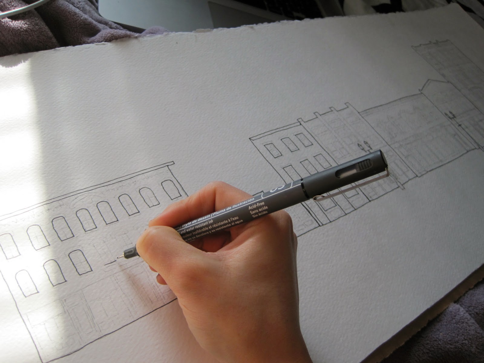
I was really excited to pull out my fancy drawing pens until I realized they were all worn down and dried out. Then I got really excited to buy some brand new ones! This is the part where my interior design education really started coming out. Make sure to use line weights to your advantage with projects like this - heavier lines for more important or prominent features and lighter lines for the delicate details, they make a huge difference in the end.

Though I love the feel of the drawing as is, I really wanted to test out some watercolor pencils on this.

I've never used watercolor before, so I figured the pencil version would be easiest for me to learn with.

Everything is colored in and just waiting for some water!

Here it is! Framed up and ready for delivery. As you can see, the colors become more vibrant once the water is added, so just something to consider when using watercolor pencils.

I'm really happy with how this turned out, I set out with a plan to make this drawing/painting on the whimsical side and a bit more like an illustration than a realistic rendering. Although this project did take a fair amount of time, it is really something that anyone could do - just takes some tracing then coloring in the lines!
--Heather
posted by . @ Friday, February 03, 2012
0 Comments
![]()


0 Comments:
Post a Comment
Subscribe to Post Comments [Atom]
<< Home